By Brian French
FLORIDA BUSINESS INTELLIGENCE — VOL. 47
Please, For the Love of Humidity, Stop Using Line Charts in Your Florida Presentations
Visual clarity matters most when you’re trying to beat the noise of modern media, and that noise is louder than ever. This companion look at how the outrage industry is selling us our own anxiety shows exactly what you’re competing against for your audience’s attention.
A modest proposal for surviving the quarterly review without a room full of people suddenly forgetting what a trend line is.
By the Editorial Board · Business Sanity Desk · Tampa, FL
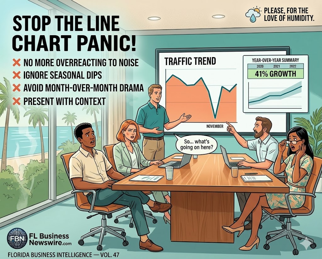
There is a particular kind of madness that descends on a Florida conference room the moment a line chart appears on the screen and that line — that beautiful, upward-sloping testament to your team’s hard work — dips. Just slightly. Maybe 3%. Maybe it’s seasonal. Maybe Google decided to sneeze. It doesn’t matter. The room changes.
The air conditioning, which was already set to “meat locker” for reasons no one has ever satisfactorily explained, seems to get colder. Someone uncrosses their legs. A vice president tilts their reading glasses down.
And then it comes: “So… what’s going on here?”
What’s going on is that you made a chart. That was your first mistake.
The Anatomy of the Panic
Here is what happens in the human brain — specifically the Florida business-human brain — when confronted with a line that goes down even briefly: it forgets everything that came before it. Twelve months of impressive growth, thousands of new customers, multiple awards from organizations you’ve never heard of — gone. The only data point that matters now is the one where the line went south.
The chart could show that you started the year with 8,000 monthly visitors and ended it with 52,000, with one modest dip in November when Google, as is Google’s sacred right and cosmic duty, reshuffled its algorithm for absolutely no reason and told no one. It doesn’t matter. That dip is now a crime scene, and you are the primary suspect.
“The chart could show that you started the year with 8,000 visitors and ended it with 52,000. That dip is now a crime scene, and you are the primary suspect.”
Data-heavy decks and dashboards are exactly where AI coding tools shine right now. This practical breakdown of five important tasks AI coding tools can do for Florida businesses shows how to automate analytics and visuals without hiring a full data team.
The Google November Situation
Let us take a moment to appreciate the special cruelty of what Google does to website traffic every year with the reliability of a Florida thunderstorm: it drops, for a month, for everyone, with no explanation, and then it comes back. This is not a bug. This is not your fault. This is not, despite what your CFO will imply with their eyebrows, a reflection of poor strategic execution.
Google has approximately 27,000 algorithm updates per year, of which the internet collectively notices about 40, panics about 15, and never fully understands any of them. A 6% dip in organic traffic in November is as inevitable as snowbirds arriving on I-75 in October going exactly 54 miles per hour in the left lane.
And yet. You put it on a chart. You showed the dip. And now you are in a meeting explaining to people who have heard of “SEO” but cannot define it why the internet briefly liked you slightly less for one month while still liking you 41% more than it did a year ago.
The response to this question — “what happened in November?” — is supposed to be calm, data-driven, and reassuring. What it becomes, after the fourth follow-up question, is something that sounds uncomfortably like: it wasn’t me, it was Google, I don’t control Google, nobody controls Google, Google is essentially a weather system with a Terms of Service, please stop looking at me like that.
This is not a good look. The chart did this to you.
The Cure That’s Worse Than the Disease
The truly nightmarish part of the Florida conference room traffic panic is not the initial interrogation — it’s what happens next. Decisions get made. Action items get assigned. A task force assembles. Someone suggests paid ads. Someone else mentions a podcast. By the time the meeting ends, you have a seventeen-point content strategy, a new posting schedule that no one will maintain past February, and a commitment to “really lean into LinkedIn” that will haunt you for quarters to come.
What actually happened: Google had a routine algorithm fluctuation. Traffic dipped 6% in November, recovered fully in December. Year-over-year growth remains 41%. No action required.
Presentation chart choices ultimately serve the larger story you’re telling about your business and your market. This broader look at why Florida is no longer a regional economy gives Florida executives a richer macro backdrop for their own internal and client-facing narratives.
What the meeting decided: Hired a content agency. Committed to 4 blog posts per week. Relaunched the Instagram. Started a newsletter. Bought $4,000 in Google Ads. Traffic is now down 12% from the intervention.
The dip was not the problem. The response to the dip — birthed entirely from a line chart that told a story of brief, normal, completely ignorable variance — that was the problem. You have done more damage to your website traffic trying to fix a problem that didn’t exist than Google’s mood swing ever could have.
This is a known phenomenon in data visualization circles, though it is rarely discussed in the specific context of Florida business meetings, where the stakes are somehow always either extremely low or cosmically high, with nothing in between. The technical term is “overreaction to noise.” The Florida term is “the whole team spent Q4 on a podcast that got 11 downloads.”
What to Do Instead
The solution is not better charts. There is no such thing as a chart that is panic-proof in a Florida conference room. You could show a line that goes up for 47 consecutive months and someone would ask about the month it only went up 2% instead of 4%. “Is there something we should be worried about?” No. Stop it.
The solution is to present numbers the way Floridians understand weather: with context, with ranges, and with the implicit acknowledgment that some fluctuation is simply the nature of existing in a system you do not fully control. You don’t cancel a beach trip because it rained on a Tuesday in July. You also should not restructure your digital marketing strategy because organic traffic dipped during the month everyone is buying Thanksgiving flights on their phone instead of browsing your website.
Show the year-over-year number. Show the trend line with a confidence band. Add a footnote that says “November is seasonally soft across the industry” and say it with the calm, slightly-bored authority of someone who has seen this before and is not concerned. Do not show the month-over-month line chart unless you are prepared to explain, at length, why one of the months has a smaller number than the previous month and why that is normal and fine and does not require a podcast.
Or, alternatively: use a table. Nobody panics about a table. A table is just numbers, arranged horizontally, waiting politely to be ignored. It is the most underrated tool in the Florida business presentation arsenal, and it will never, not once, cause someone to ask “what happened here?” with the energy of a detective who has just found the body.
The line chart is not your friend. It is a drama machine disguised as a data visualization. It takes your best year and hides it in the valley between October and December. It transforms your rational colleagues into pattern-recognition algorithms with expense accounts.
Put the chart away. Show them the number. Say it’s up 41%. Let them take a sip of their coffee. Go home at a reasonable hour.
You’re welcome.
Better visuals are only half the battle — the other half is making sure the story lands with the right audience online too. This companion read on the top Florida business marketing strategies for 2026 lines up the content, distribution, and channel moves that turn a great deck into measurable growth.
This article was written in a Tampa conference room at 2:47pm on a Thursday. The author’s traffic was down 4% that month. They did not start a podcast. They are fine.
About Brian French
Led by a commitment to tech-intelligent curation, Brian French tracks and analyzes breaking business news with Fl Business Newswire. Brian brings an extensive financial background to his analysis, having graduated from the University of South Florida in Finance and serving as a Vice President and Portfolio Manager for Merrill Lynch Private Investors and the Trust Department in St. Petersburg, FL, as well as a Vice President and Trust Investment Officer for SunTrust Bank in Sarasota, FL. His writing blends macroeconomic trends, capital market analysis, corporate strategy, and modern digital insights for a sophisticated look at Florida's business market.